Showpass
Redesigning the Orders page to simplify ticket management
2024
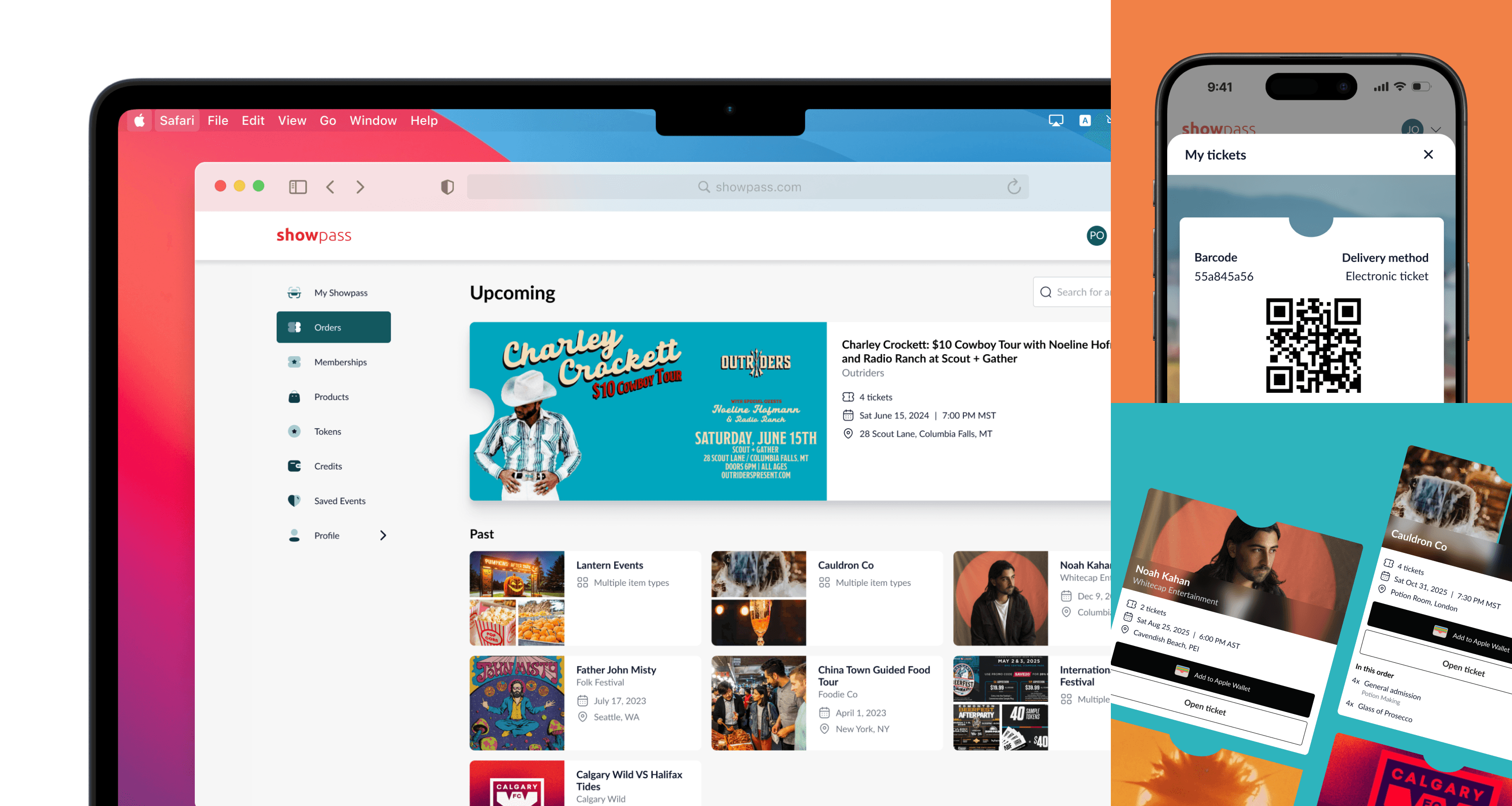
The Orders page is where Showpass customers view and manage their tickets. When we introduced NFC tickets and took on a major client contract, we discovered some problems: the page was hard to use on phones, managing multiple tickets was confusing, and it took too many steps to do basic things.
Leading this project, I focused on two main goals: making it easier for customers to use and designing it in a way that can scale with Showpass.
Downloading a ticket on your phone took 6-7 steps - which is way too many (I included scrolling as an interaction step in my count). I mapped out how users were using it and found several pain points that were slowing a lot of users down.
I simplified getting your tickets (both NFC and regular) down to just 2 steps. This means fans can get into events faster with less effort and our venue partners have shorter lines at the door.
before
after
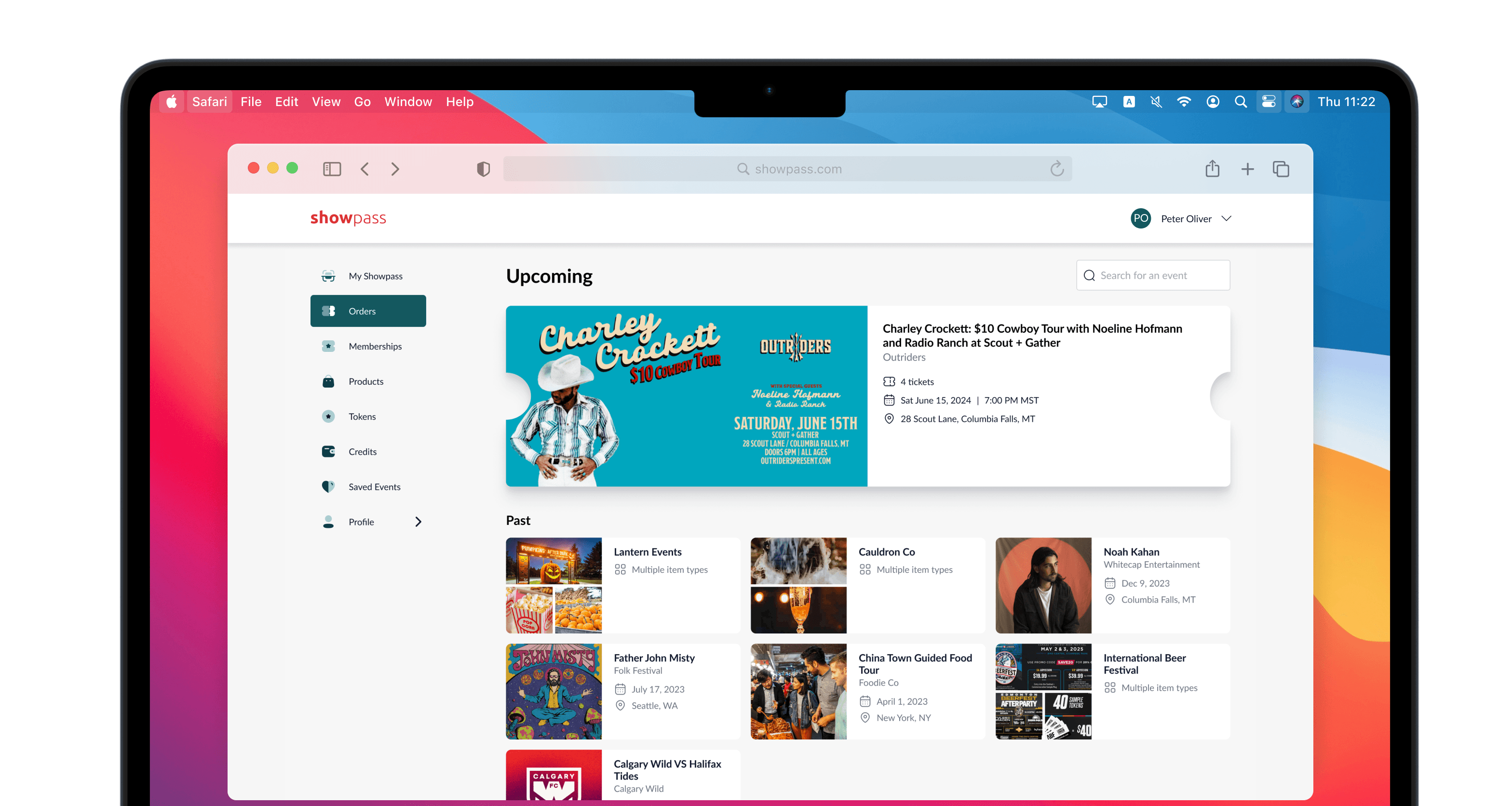
I initially considered featuring a main hero image with supporting sub-images to illustrate orders that include multiple items, but this would have introduced new and unnecessarily complex logic to the code. Instead, I chose a bento-style layout that shows up to three images—simpler to build but still easy to understand.
On both desktop and mobile, I moved the barcode behind a button, freeing up space for more useful information. Now when you're on your phone, you can quickly scan your ticket, while on desktop you can easily find options for transferring or reselling tickets.
So what happened in the end?
1. Getting to your tickets is faster and simpler - just two clicks/taps instead of six or seven
2. The Orders page (formerly 2 separate pages) builds more excitement leading up to events and has clearer visual grouping for when customers have purchased multiple items
3. Whether customers are on their phones or computers, they can find exactly what they are looking for without the clutter
before
after
New project, new lessons
This project taught me many things, but specifically something interesting about presenting design work. After a change in company strategy, I shifted how I shared my ideas. Instead of talking about how this project aligned with the company mission, I focused on the real problems it solved for our users and venues.
I learned that while company values matter, different stakeholders care about different things so the ability to “read a room” to anticipate biases, and tailor your presentation can be just as critical as good design.