Simplifying ticket management for fans
Showpass

Year
2024
Company
Showpass
Team
Myself
This project redesigns the Orders page on Showpass to simplify a high-use user flow, and elevate the fan experience; the company mission.
I championed this redesign to speed up digital ticket downloads and to address new client needs with multi-item orders.
The result is a faster process that helps customers access their tickets with less effort while simplifying overall ticket management. These improvements enhance customer satisfaction and reduce support costs by minimizing basic, preventable inquiries.
Main focus areas
Problem 1
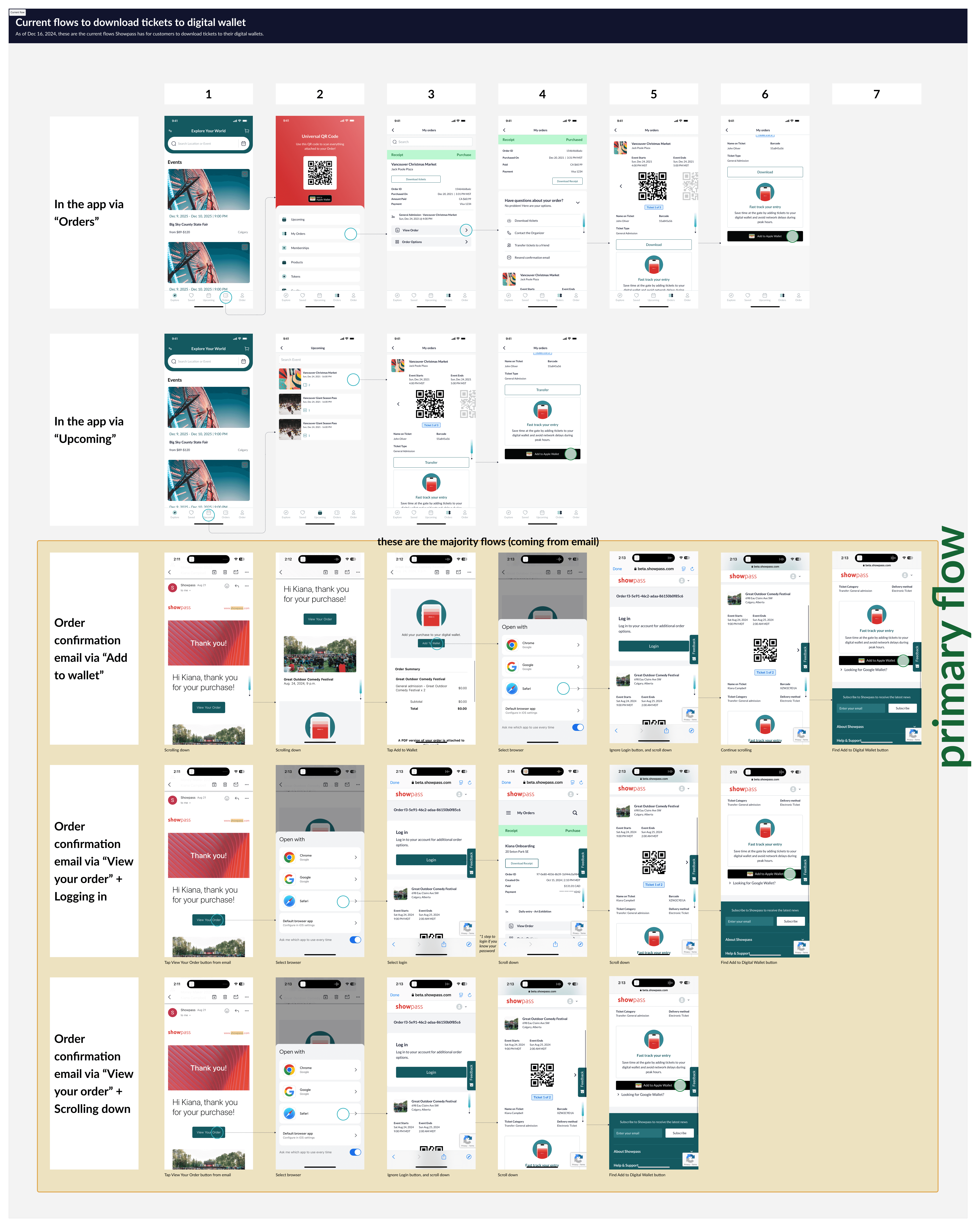
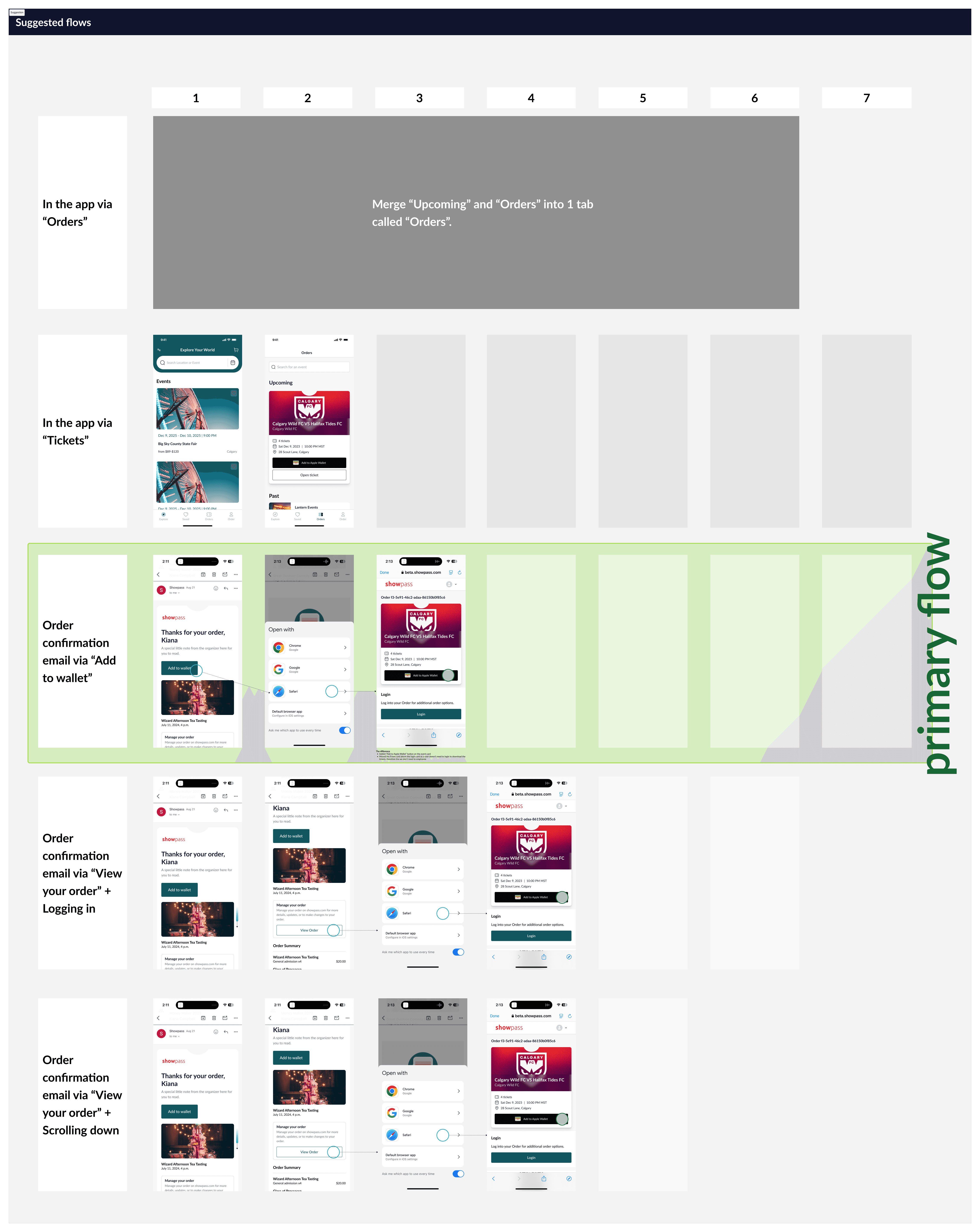
Why does it take 6-7 interactions to download tickets to your digital wallet?
The process of downloading tickets to digital wallets—especially on the primary mobile email path—involved 6–7 interactions, creating a frustrating user experience.
Solution 1
Prioritize what a user is looking for and when
Adding a button and repositioning a component higher on the page streamlined the mobile ticket download process from 6–7 steps to just 3. Yes this is less taps, but more importantly, it's less effort for a user.
Before
After
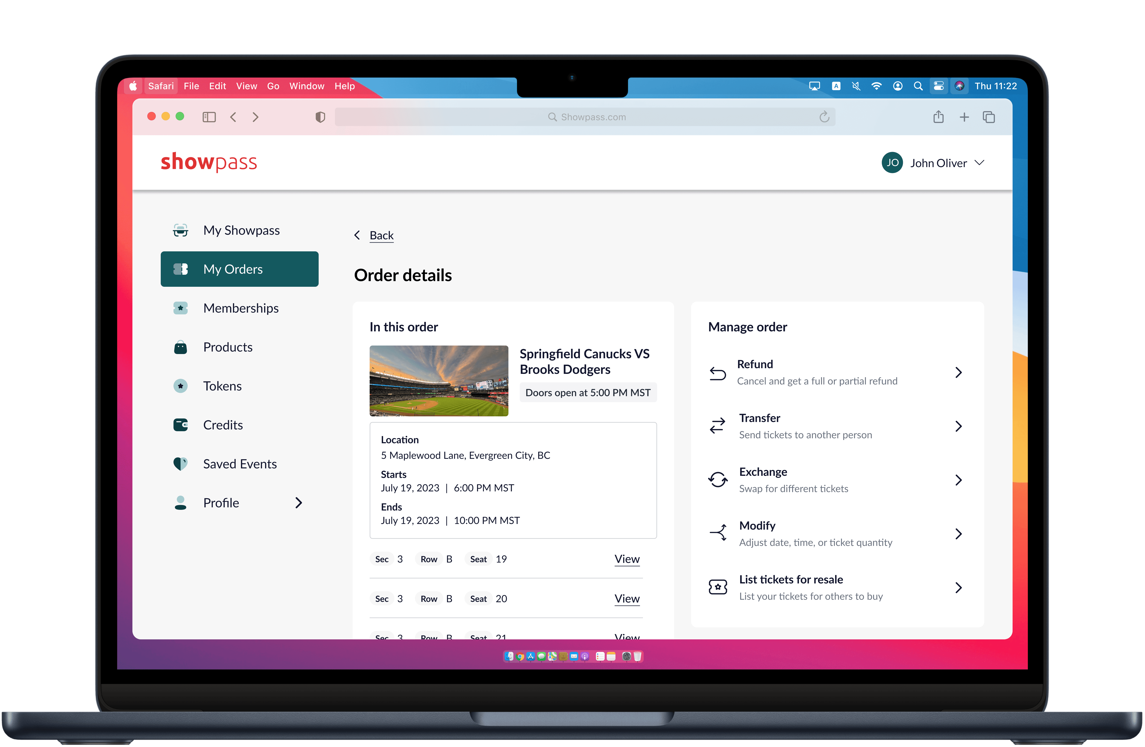
Problem 2
How can we avoid creating a new invoice card when a customer updates their order—and while we’re at it, improve the fan experience at this point in their journey?
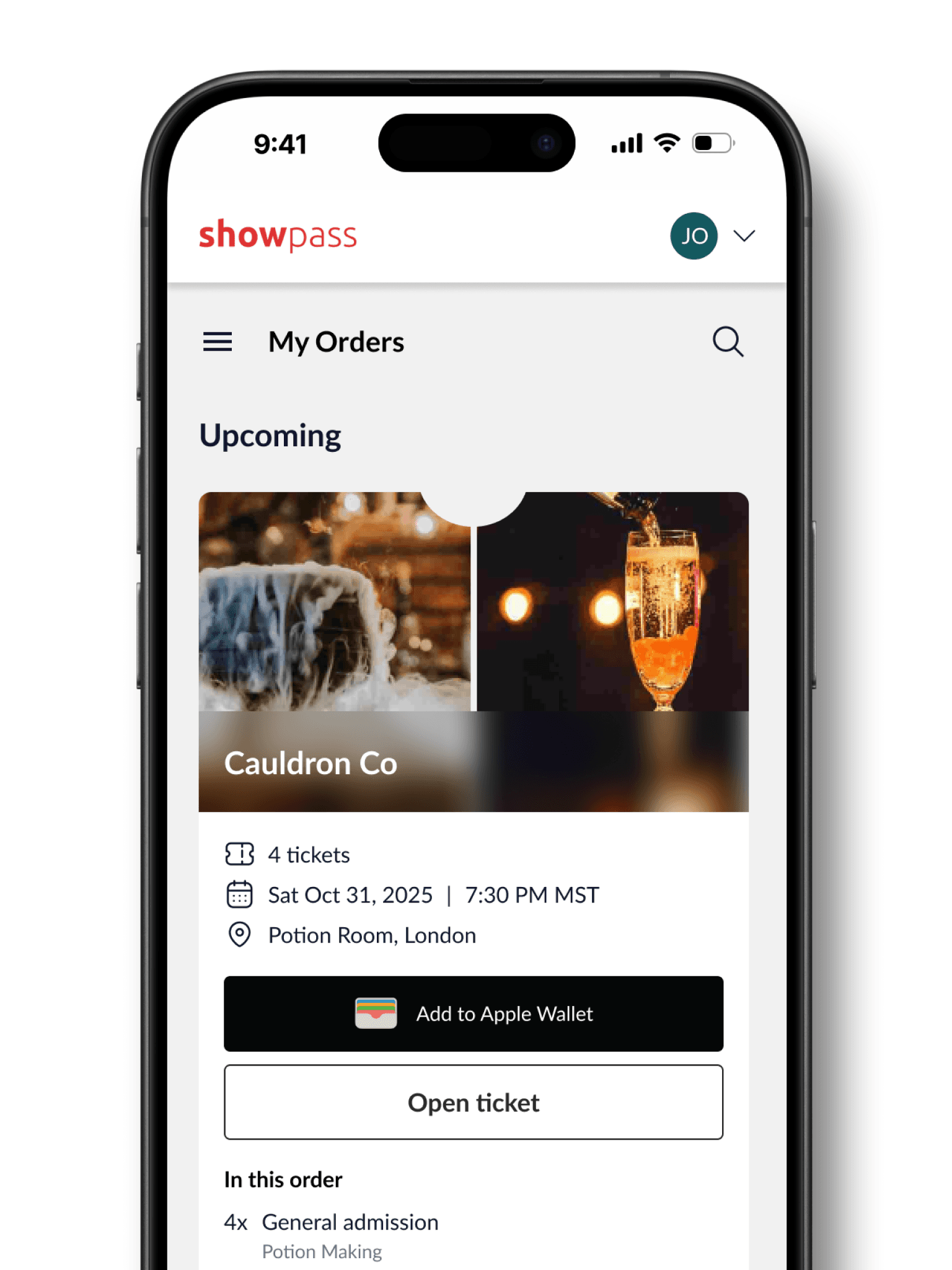
With the addition of post-purchase order functionality for our latest client, it became clear that we needed a clearer visual representation for orders with multiple items. Additionally, the page lacked visual excitement and did not elevate the fan experience.
Solution 2
Account for edge cases, but don’t let them define the design for the majority flow
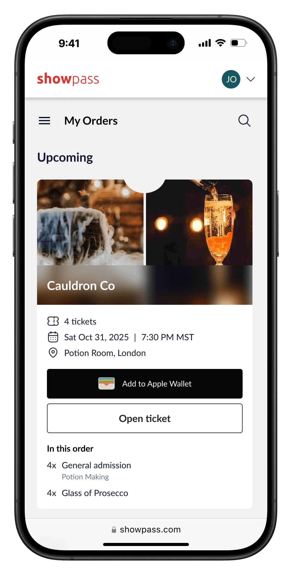
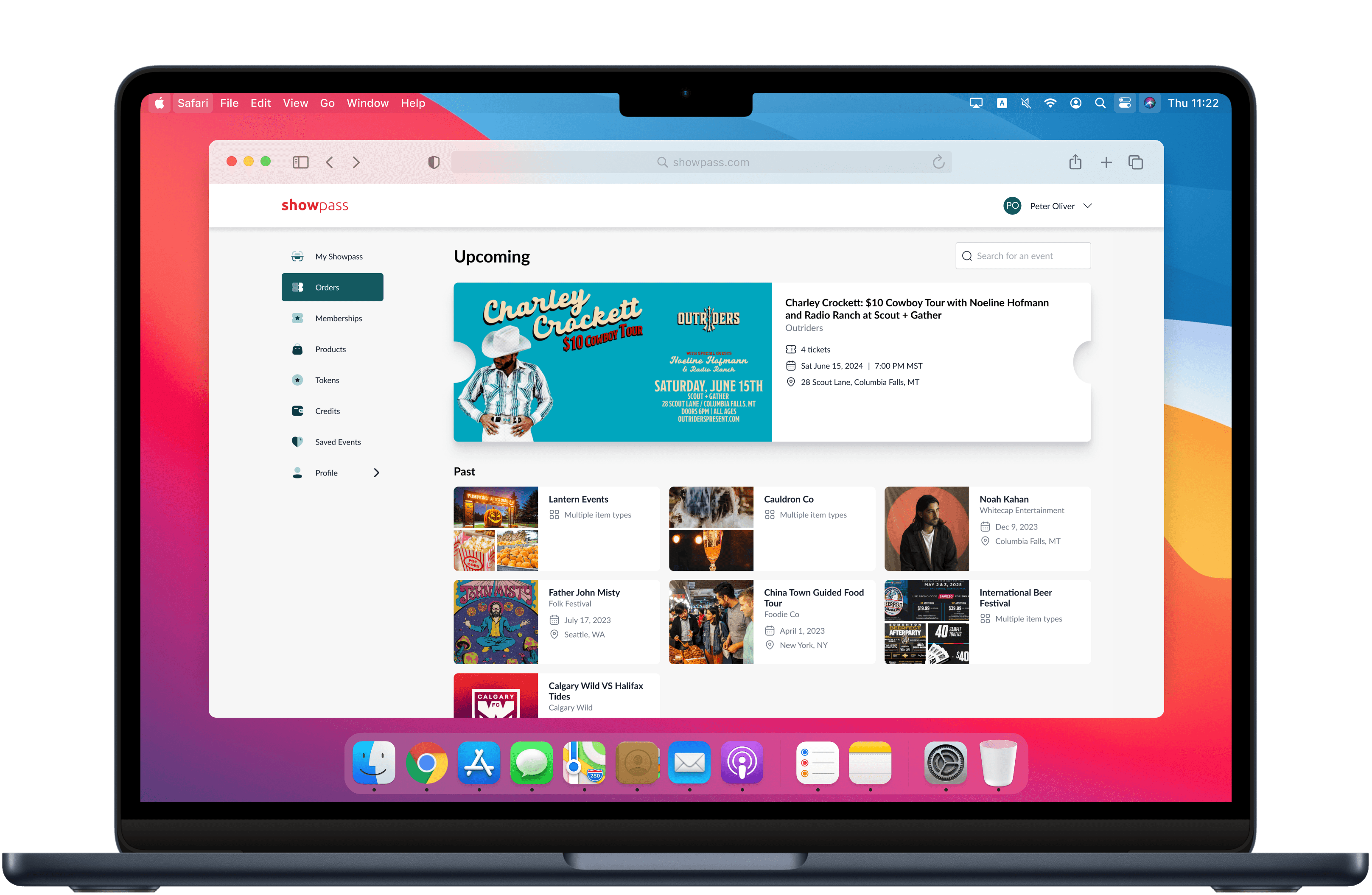
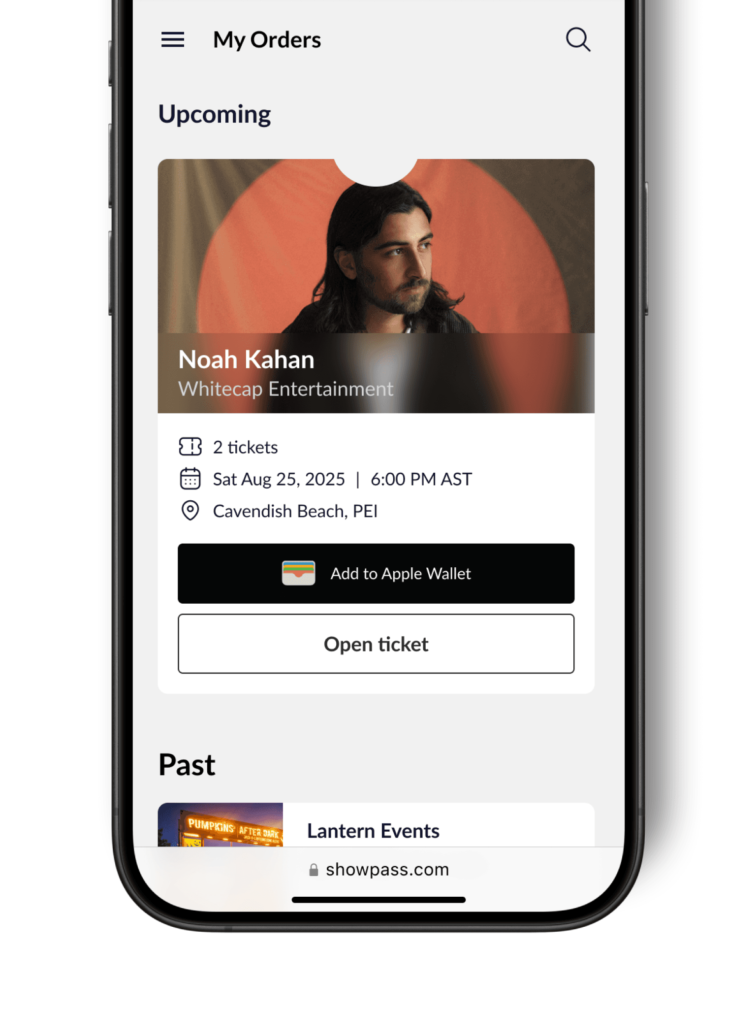
I used large event images to build excitement for fans’ upcoming events, while past events were displayed smaller below to make the Orders page feel like an album of new and past experiences. For multi-item orders, I adopted a bento-style layout, stacking up to three images. This approach keeps the design clean and consistent, avoiding unnecessary complexity.
Before

After

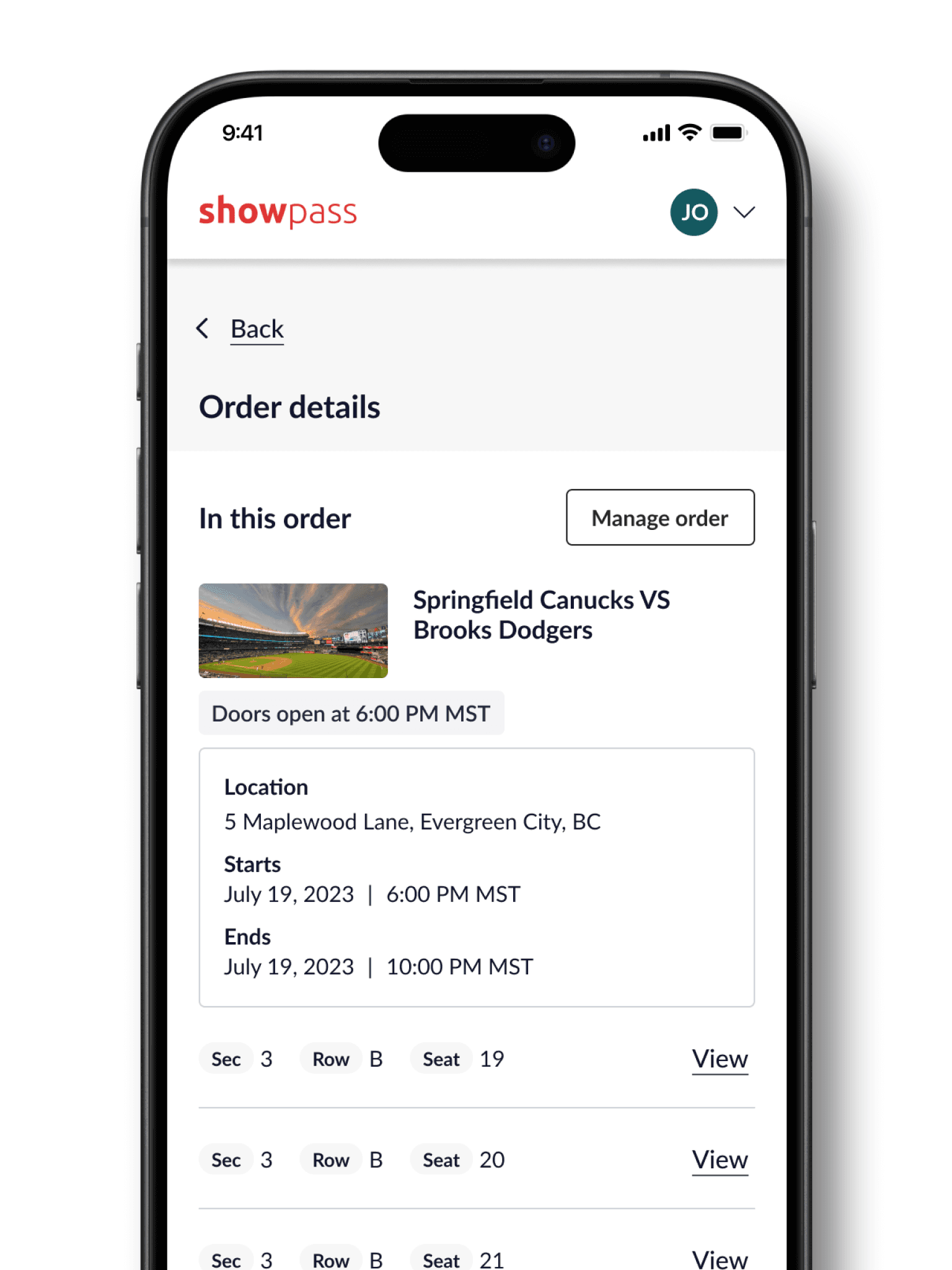
Problem 3
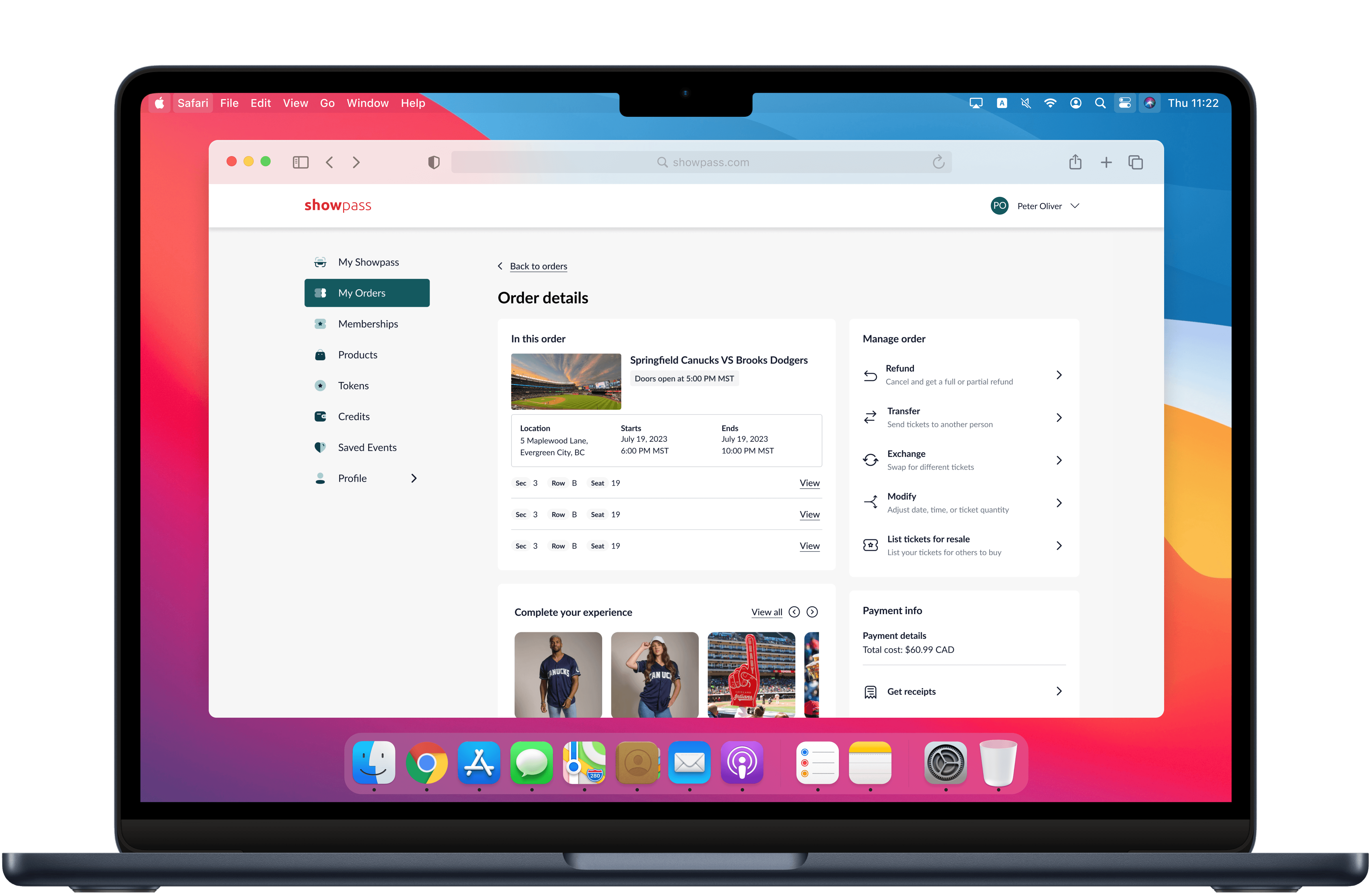
Majority of our users are on mobile, this device needs to get priority
The order detail page was not optimized for mobile. Cards took up a lot of space and made it difficult for customers to get to their tickets, or find relevant info on the page.
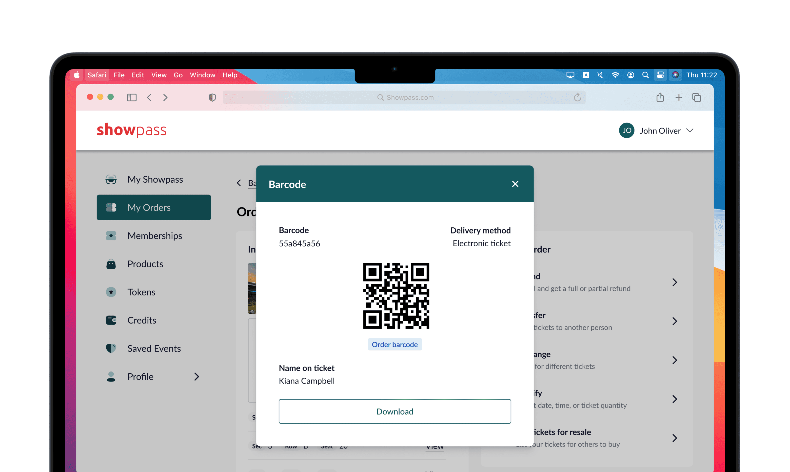
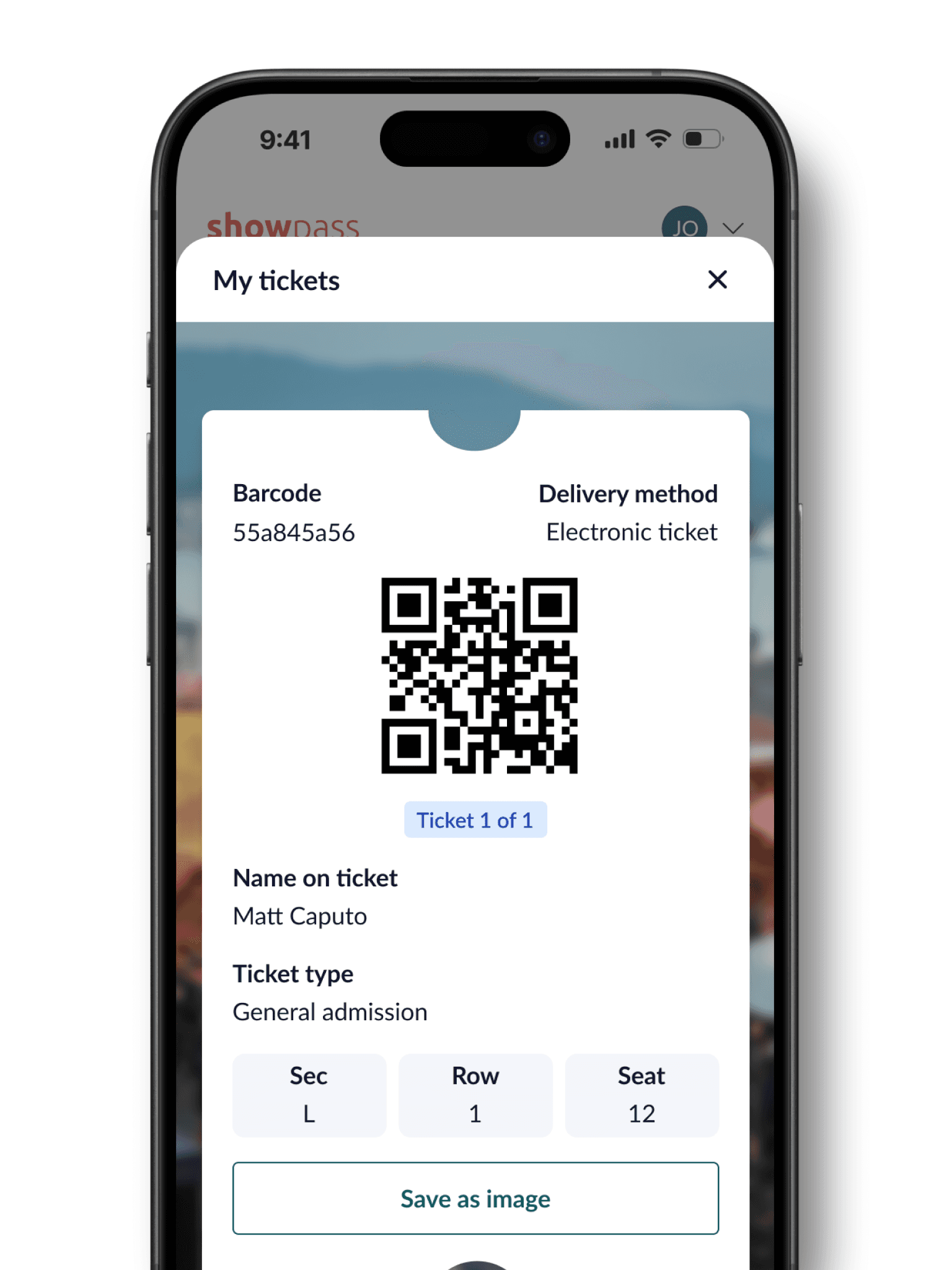
Solution 3
Show the barcode only when it’s needed
I rethought the ticket display design to improve mobile functionality and screen space. The barcode, traditionally visible by default, took up valuable space when not actively scanning. By hiding it behind a button, I freed up space on both mobile and desktop, allowing for a shorter scroll and better emphasis on order options.